Jostens - Yearbook Design
With more than 14 years of creative experience at the world's leading yearbook publisher, I have designed and collaborated on nearly 5,000 yearbooks. These are some examples of how I have utilized my skills to push their products past their limits and take the designs to the next level.
CHIPLEY HIGH SCHOOL
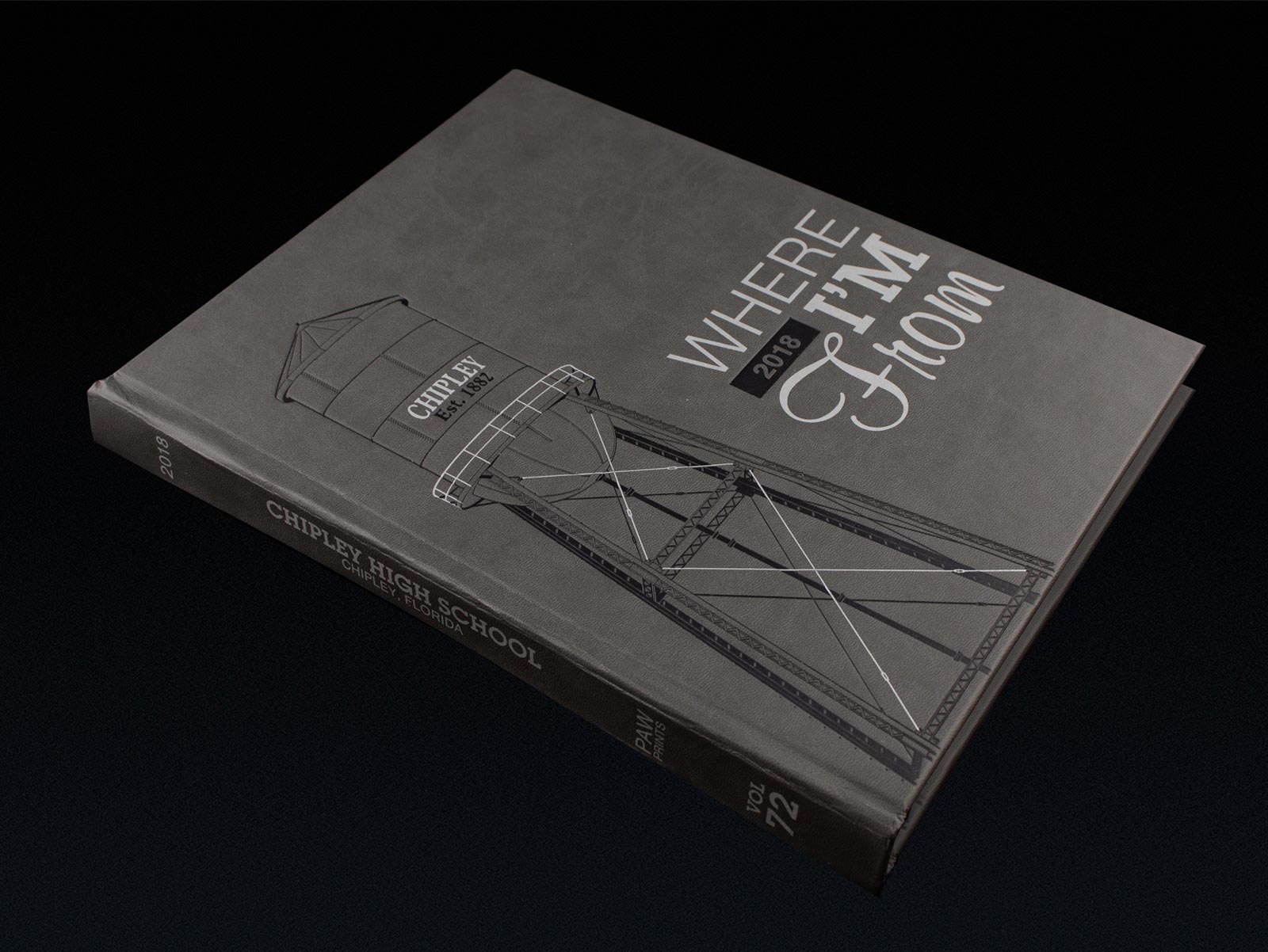
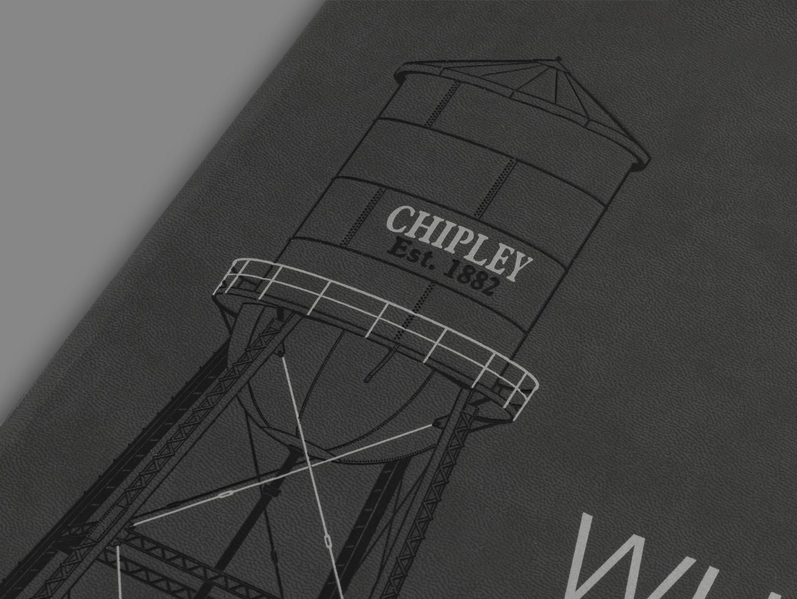
The water tower on 5th Street in Chipley, Florida, was a major landmark before it was torn down. Chipley High School wanted to celebrate the tower by featuring it on their yearbook with the phrase "Where I'm From." Knowing the design would be burnished into the material, I illustrated it in a way that would give it shadows and depth.
PALMETTO RIDGE HIGH SCHOOL
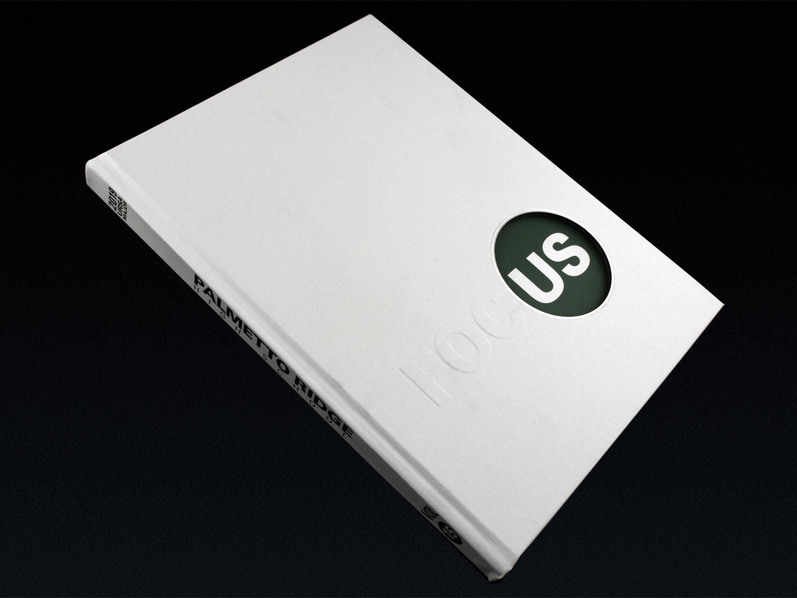
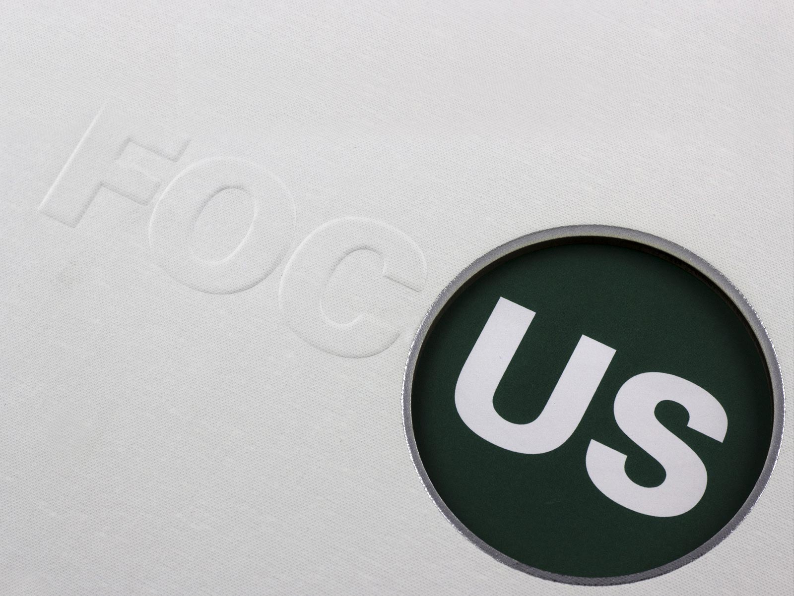
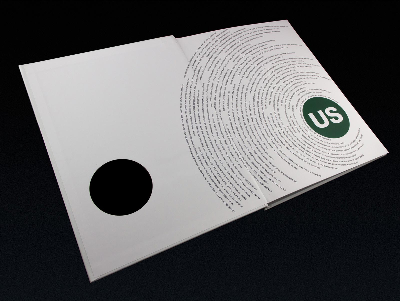
Palmetto Ridge used the theme "Focus" for their yearbook. The letters F O C are blind embossed on a linen material. A circle outlined in silver foil is cut into the cover, exposing the inside page. The US portion of the word is printed on the inside page where the remaining letters U and S are printed. Encircling the design are focus quotes written by students.
LAFAYETTE CHRISTIAN SCHOOL
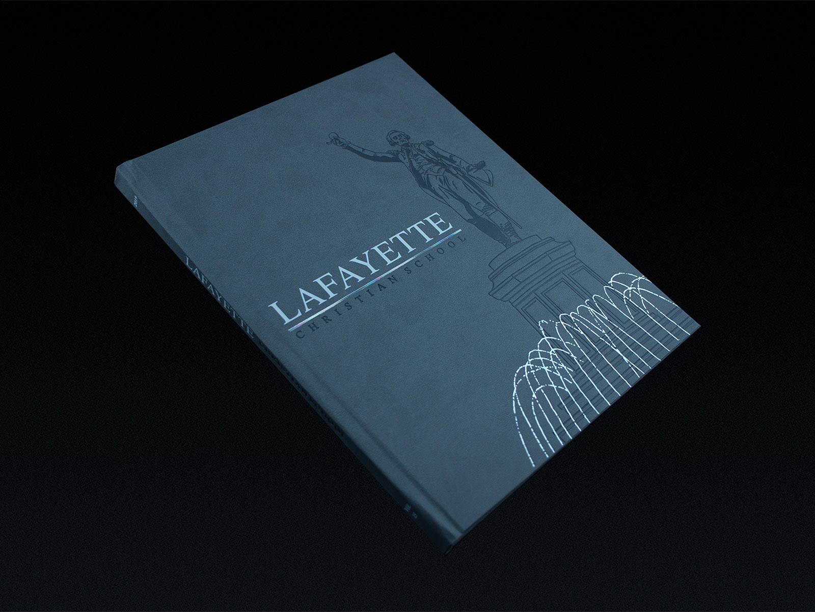
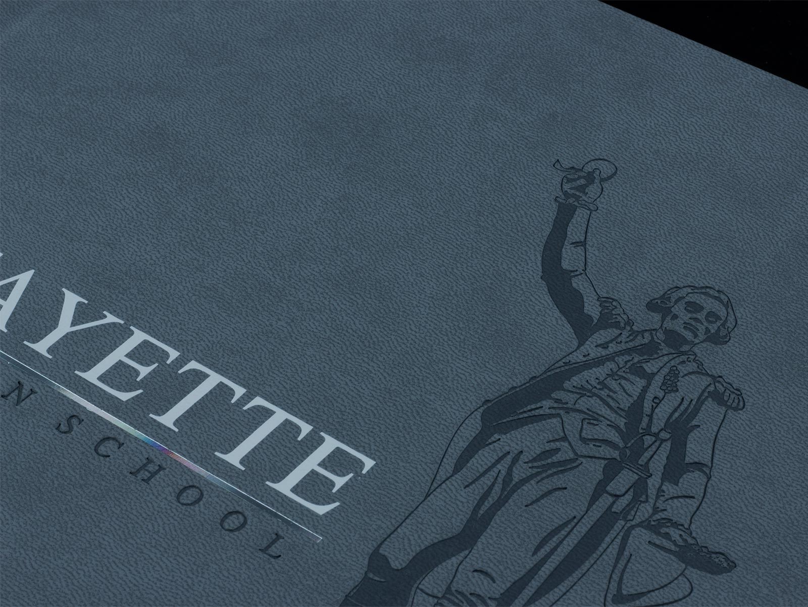
Lafayette Christian School wanted to feature a beautiful fountain in their Historic Downtown LaGrange. This is another example of a burnished design I illustrated in a way that would give it shadows and depth. The water is applied with a rainbow foil to reflect light similar to the way water does. If you look closely, you can see the rainbow foil reflecting light off the line below Lafayette.
TRINITY PREPARATORY SCHOOL
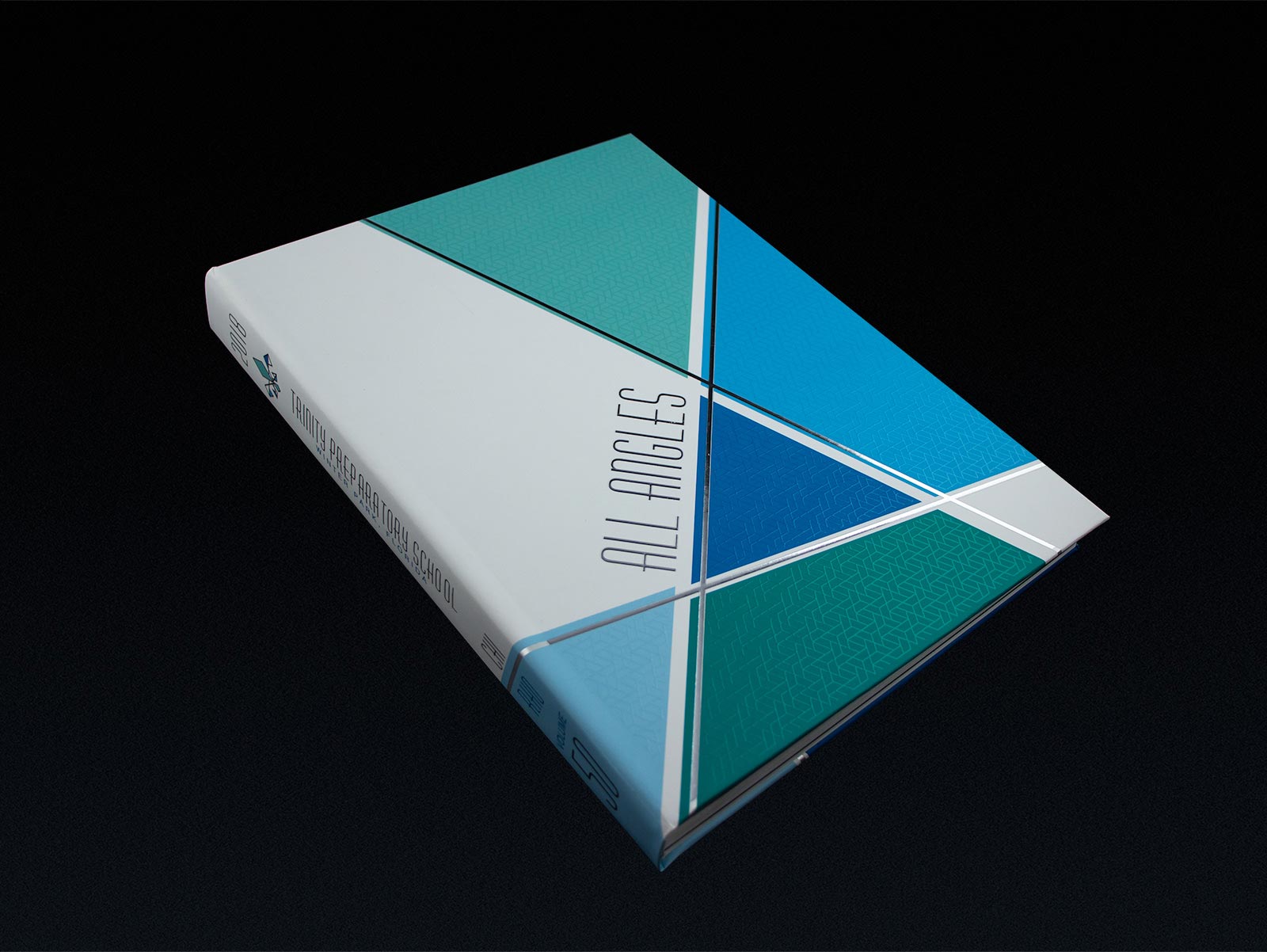
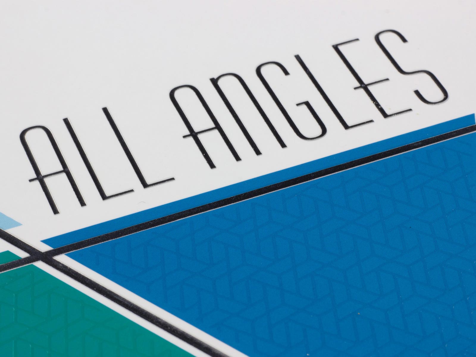
Using the theme "All Angles," I created a gestalt design that expressed the theme literally. The design features multiple angles in various colors. Perpendicular, offset lines are printed in silver foil. To further illustrate the theme, a subtle pattern was printed on the colored shapes with raised spot UV.
TRINITY PREPARATORY SCHOOL
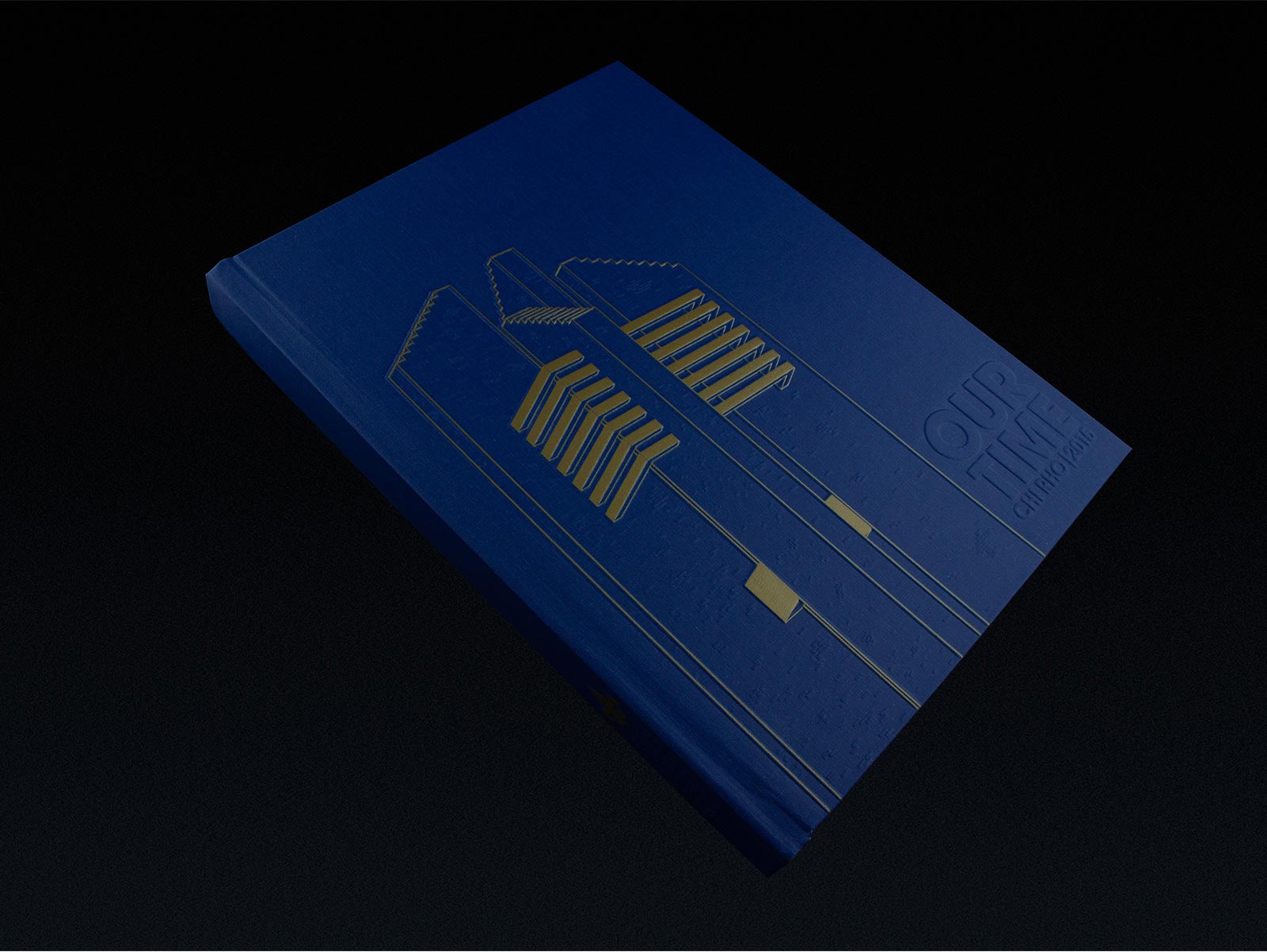
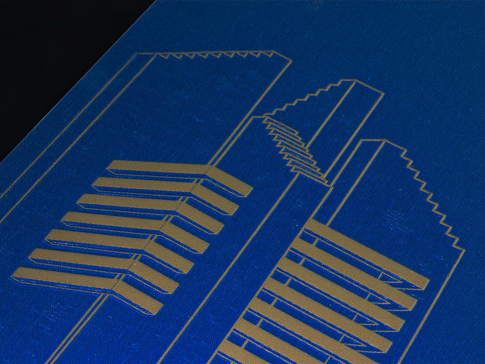
Trinity Preparatory School has a very unique bell tower on campus. Bells are a major focus of their alma mater, so they wanted to feature it on the cover. I illustrated the tower to be printed on a royal blue linen with yellow-gold silkscreen. The silkscreened areas are embossed, and the bricks are blind embossed to be subtle enough not to take attention away from the main design.
DUNWOODY HIGH SCHOOL
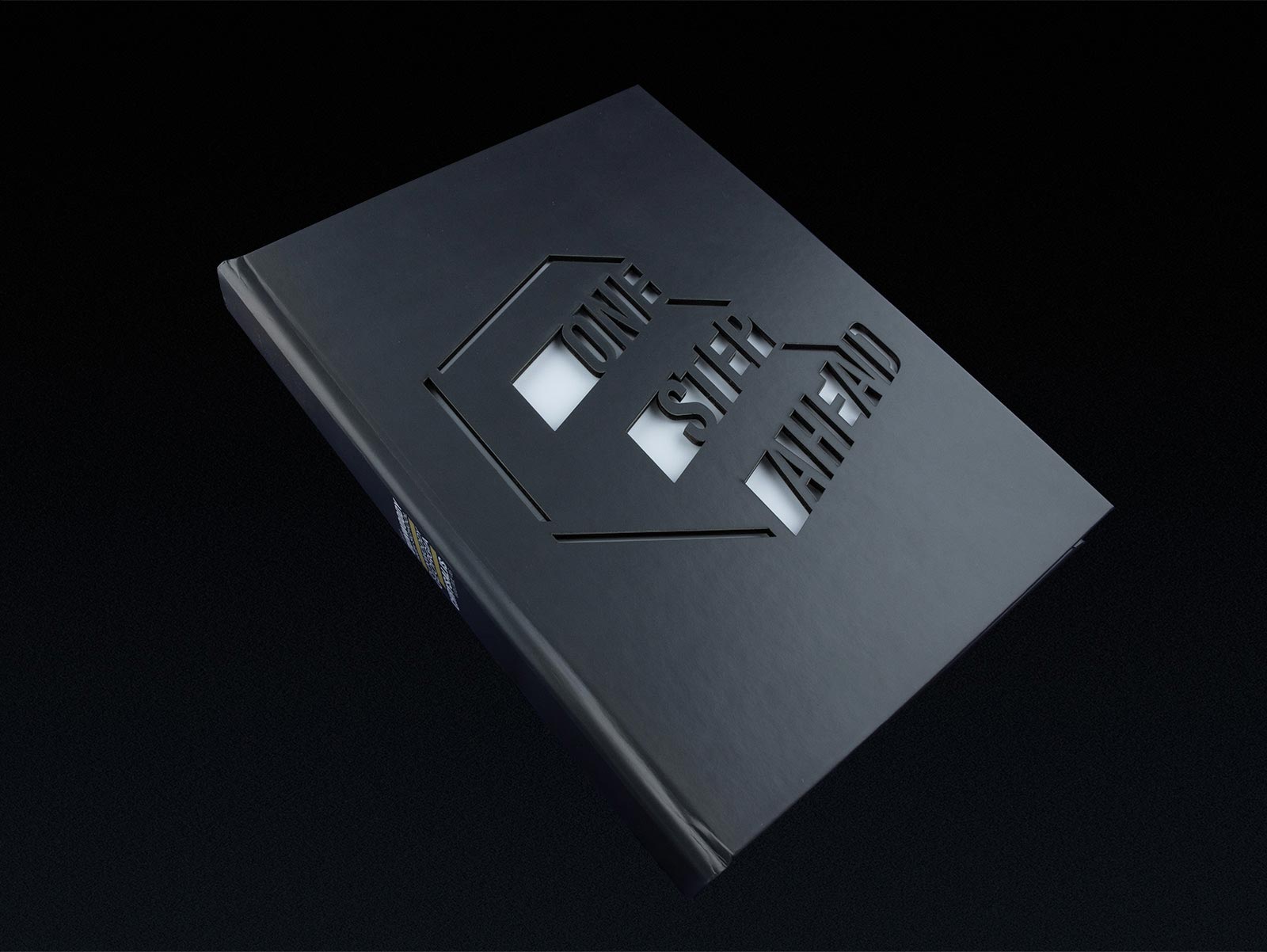
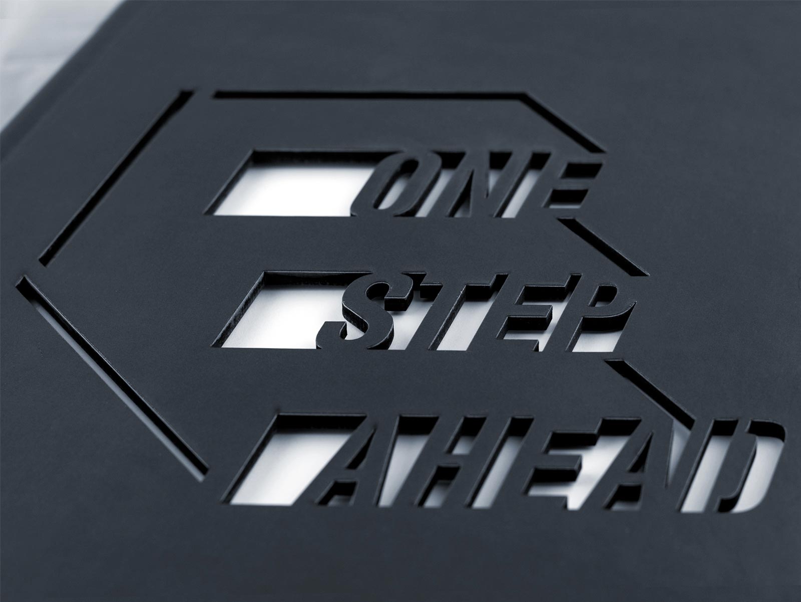
One Step Ahead was designed as a logo to literally illustrate the phrase in the shape of stairs. By cutting the design into the cover, it provided the viewer with a window into the book, making them one step ahead. The letter D was also placed a step ahead of the other letters because Dunwoody, the school's name, starts with a D.
COOSA HIGH SCHOOL
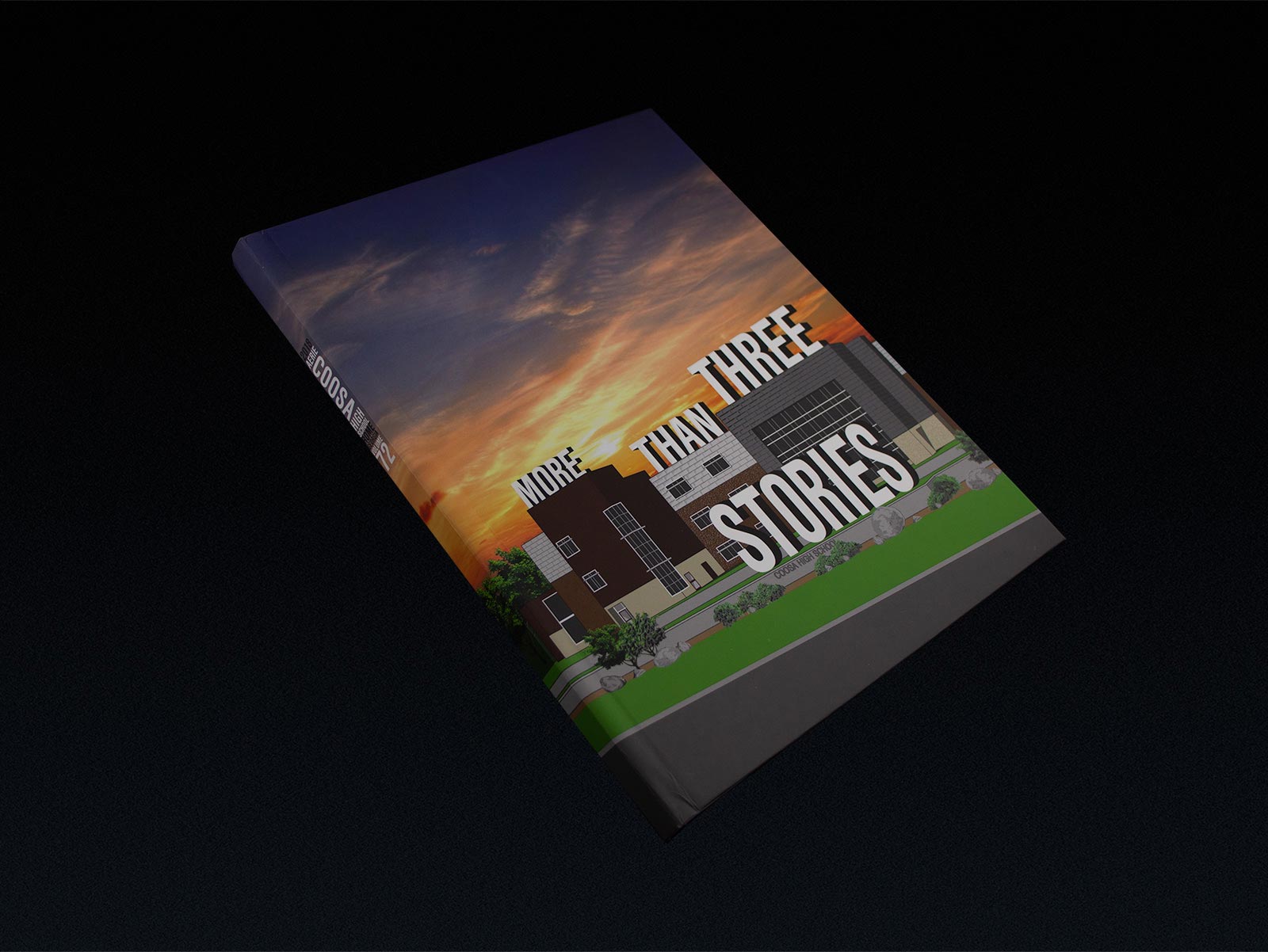
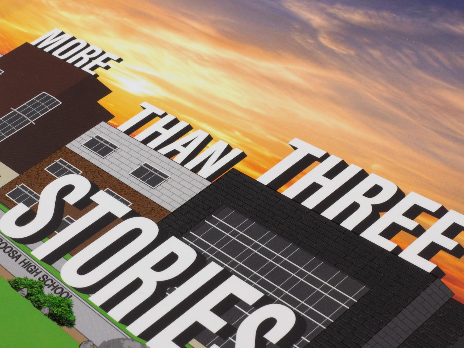
Coosa High School built a brand new campus to be opened in 2018. There was a lot of focus on their new building in the community and they wanted to express there was more to it than just the surface. I illustrated their new campus, adding three-dimensional text to convey their idea.
DESIGN CONCEPTS
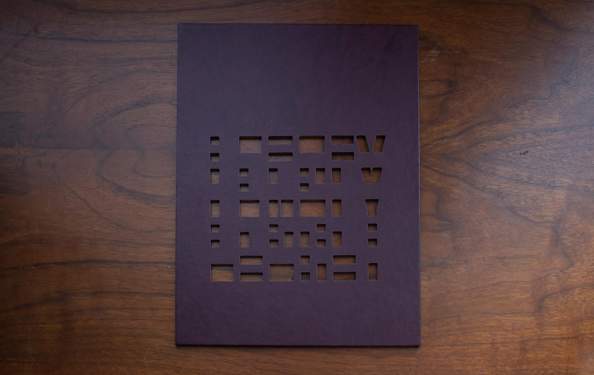
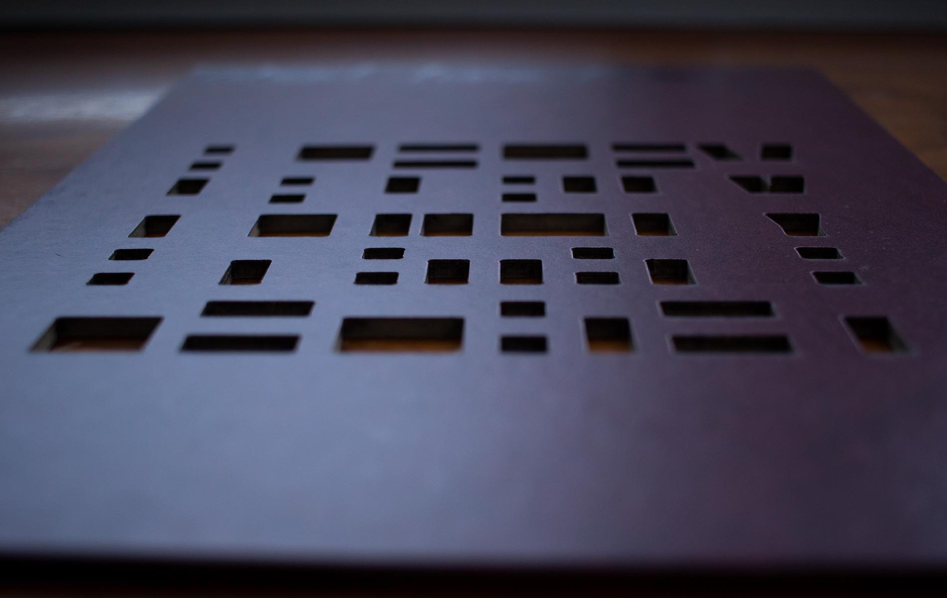
Yearbooks already have ways of being interactive, but I like to take it a step further. Jostens offers great applications for yearbooks such as UV coating or embossing. One of the best options is a laser cutter for creating die cuts. I created a design using the laser-cutter that would literally change your perspective. Using the details of one of our Texas clients who titled their book "Legacy," I created a pattern that is only legible when viewed as a flat plane. The pattern is indiscernible as a word, but when the book is held flat at eye level, the word appears.
I had a few physical samples created to market the application to our clients. Many of them adopted the idea and published a book using the interactive laser-cut application.


